The Complexity Retrospective
Use:
When your project is suffering from excessive complexity
Length of time:
40-60 minutes
Short Description:
Many projects go awry due to excessive complexity; and it's always worth evaluating whether your team is approaching things in the simplest way that can work; especially when the deadlines begin to loom.
I recently lead a retrospective with my team focusing on complexity across all the areas of our project, using a handful of techniques from “Agile Retrospectives - making good teams great” (a must have for every agile team).
Materials:
Whiteboard or flipchart, paper & pens.
Process:
We structured the hour long retrospective into 5 parts:
- Setting the stage
- Gather data
- Generate Insights
- Decide what to do
- Close / Action plan
The purpose of “Setting the stage” is to get everyone engaged and thinking about the same theme. To do this I reminded people of the actions we had set ourselves from the last retrospective, then asked each person to complete the sentence “If we were a military commando, and our mission was last retrospective’s actions, we would be _______”
I then told the team that, in this retrospective, we would be considering complexity and whether we had too much, or just the right amount, in each of the areas of our project.
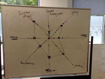
To gather data, I drew a complexity radar, with each spoke a different area of complexity. I began by suggesting a couple of generic spoke names (Data model, Workflow), and then got the team to suggest the other areas. Using dot voting, everyone voted as to where they felt we ranked on each spoke, with closer to the centre being just right, and further away being overly complex. Joining the clustered dots produced the following radar map:
To generate insights we used the 5 whys exercise. I asked people to break into groups of 2, preferably cross discipline, and assigned each group 2 of the high ranking spokes. They were then tasked with asking each other “why is <spoke area> complex”, and “why is <answer>?” and so on, until 5 why’s had been asked. The answer to the 5th why was considered the root cause of the complexity, and recorded on a card. As the root cause cards came in, I grouped them, and when everyone was done, read the root cause groups out.
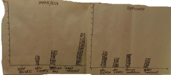
To decide what to do we constructed 2 more histograms, one considering the risk of the root cause, and the other difficulty to address the root cause. I then asked each person to vote which of the 2 root causes had had the highest impact & and which was the least difficult to address. This produced the following histograms:
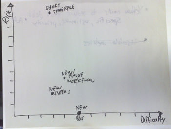
In conclusion, we then combined the impact & difficulty histograms into the following map
My intention was that the final exercise would make it simple to choose the actions to take forward for the next sprint (basically chose the low hanging fruit - the easiest things to address which had the biggest risk reduction); but there wasn’t a clear winner shown on the graph. Generating actions took a bit more discussion. We found that this format was a fun and effective way to address the complexity problem.
Hopefully you’ll find running something similar with your own team helpful!
Source: David Laing


